Beyond React: Building a Shared Element Transition from Scratch
A shared element transition looked like a simple bounding-box interpolation—until object-fit, image cropping, and border radius made the middle frames fall apart.
Tap a photo in Instagram or Google Photos and the image you selected continues into the next screen. The page changes, but the object does not seem to disappear and reappear. It moves.
That interaction used to feel native to mobile apps. It is increasingly common on the web too. Airbnb, for example, carries the image from a listing card into the property detail view.
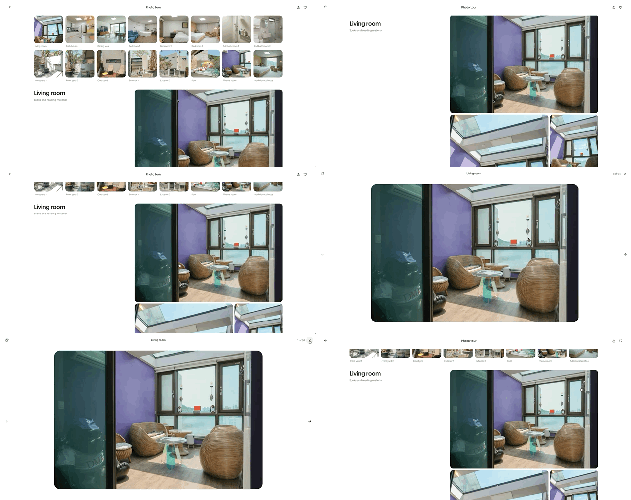
This pattern is usually called a shared element transition. It preserves context across a navigation: the screen changes, while the thing the user chose remains recognizable.
I initially thought the implementation would be simple. Measure the source element, measure the destination element, then interpolate position and size. That worked for solid boxes and images with matching aspect ratios.
Then I tried it across real screens. The first frame looked right. The last frame looked right. Everything in the middle was wrong.
This article follows that failure from the first bounding-box model to the geometry I had actually missed.
The same object should survive the screen change
A shared element transition visually connects an object that exists in two different views.
A product image grows from a grid into a product page. A mini player expands into a full player. An avatar in a list moves into the header of a profile. The motion tells the user, “the thing you selected became this.”
That is why I do not think of shared animation as decoration. It explains a change in interface state without forcing the user to rebuild the context from scratch.
Chrome's documentation shows the same idea with a thumbnail that expands into a larger image:
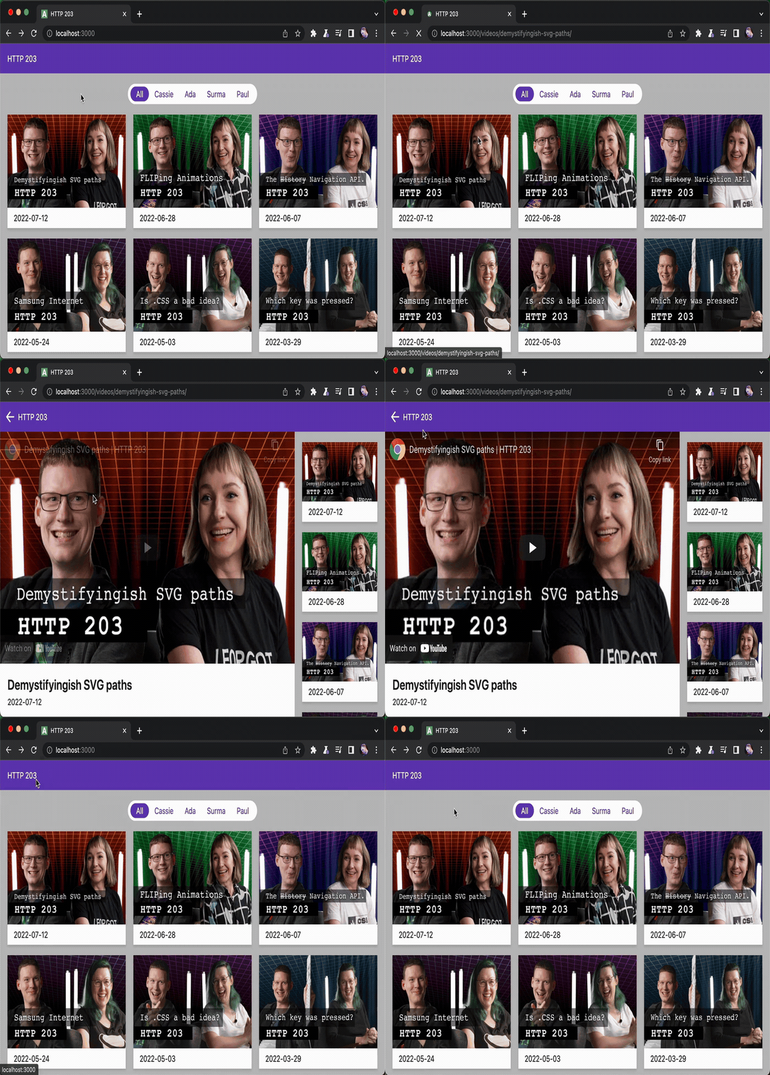
Source: Chrome for Developers, licensed under CC BY 4.0.
This pattern works especially well for:
- product list → product detail
- photo grid → photo detail
- profile list → profile
- mini player → full player
- collapsed card → expanded card
The page changes, but the object the user selected stays identifiable. So how do we create that connection on the web?
Start with the View Transition API
The web now has a native View Transition API. It is not a React API. For a same-document transition, wrap the DOM update in document.startViewTransition():
function updateView() {
  if (!document.startViewTransition) {
    updateDOM();
    return;
  }

  document.startViewTransition(() => updateDOM());
}
On a browser without support, the DOM still updates normally. The transition is a visual enhancement, not a requirement for navigation to work.
The browser captures the page before and after the callback, then transitions between the two states. To promote an element into its own shared layer, give the source and destination the same view-transition-name:
.thumbnail {
  view-transition-name: product-image;
}

.detail-image {
  view-transition-name: product-image;
}
They do not have to be the same DOM node. A thumbnail <img> in the list and another <img> on the detail page can share a name, and the browser will treat them as the same visual object.
One important constraint: two simultaneously rendered elements cannot use the same view-transition-name. In a grid, assign the name only to the selected card or give each card a unique name.
Under the hood, the browser does roughly this:
- Capture the current view as the old state.
- Run the callback and update the DOM.
- Capture the updated view as the new state.
- Put both captures into a pseudo-element tree and animate between them.
::view-transition
└─ ::view-transition-group(product-image)
   └─ ::view-transition-image-pair(product-image)
      ├─ ::view-transition-old(product-image)
      └─ ::view-transition-new(product-image)
The group handles position, size, and transforms. The old and new pseudo-elements hold the two snapshots. The default is a cross-fade, but they can be styled independently:
::view-transition-old(product-image),
::view-transition-new(product-image) {
  animation-duration: 400ms;
  mix-blend-mode: normal;
}
The returned ViewTransition object also exposes updateCallbackDone, ready, and finished, so DOM completion, pseudo-element readiness, and animation completion can be handled separately.
It is not limited to SPAs
View Transitions are not tied to React or even to single-page applications. Same-origin multi-page applications can opt into cross-document transitions with CSS on both pages:
@view-transition {
  navigation: auto;
}
There is no direct document.startViewTransition() call in this case. The browser starts the transition when navigation occurs. Same-document and cross-document transitions have different entry points, but share the old/new snapshot and named-element model.
The API can also handle changing image aspect ratios. Its old and new snapshots behave like replaced content, so authors can apply object-fit, object-position, and clipping. The browser provides the primitives, but the author still decides what the intended fit and crop should be.
Even with that native machinery available, the fundamental geometry begins with connecting a source rectangle to a destination rectangle. That is the simplest model, so it is where I started too.
Bounding boxes were enough for simple elements
The simplest shared element transition connects two bounding boxes. In the browser, those boxes usually come from getBoundingClientRect().
source bbox → translate + scale → destination bbox
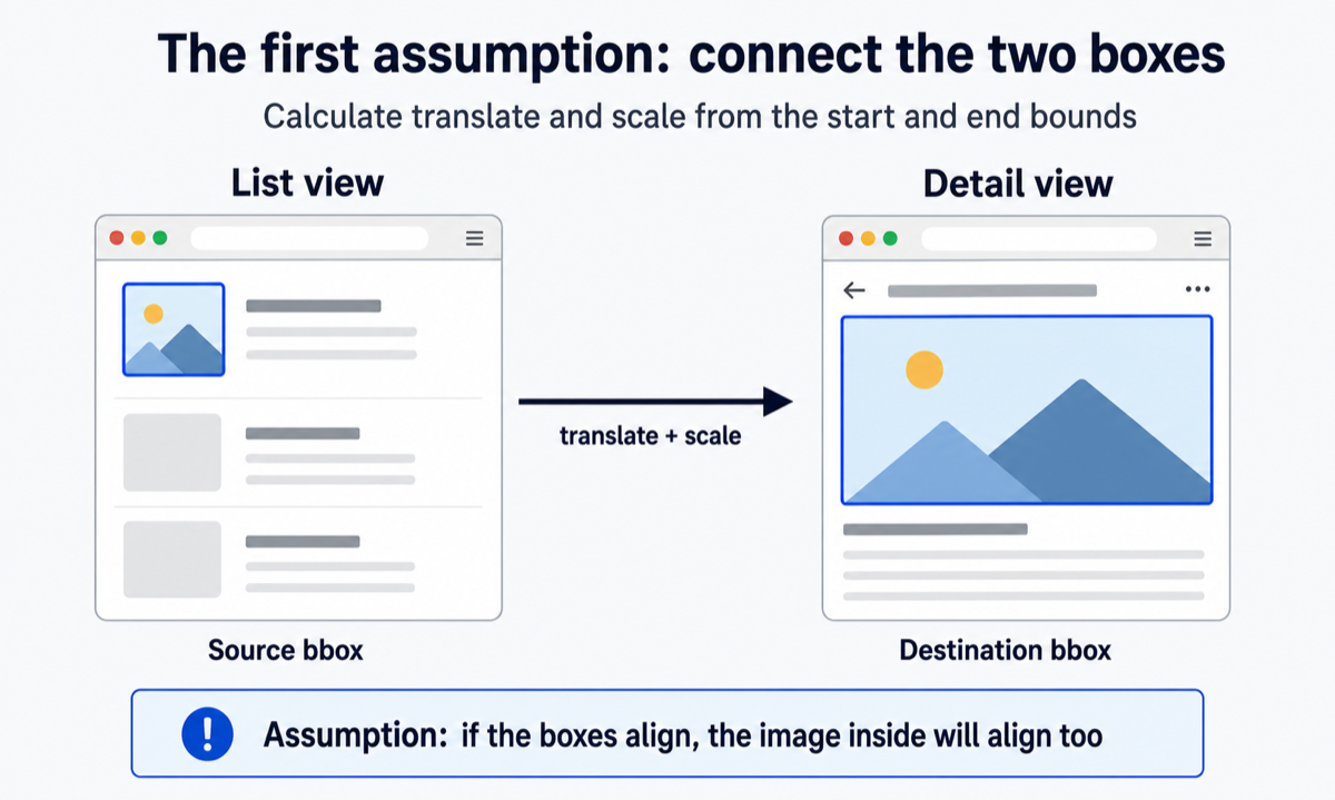
Imagine a 100×100 blue box growing into a 300×200 box. The difference between their centers gives us the translation. The ratios between width and height give us the scale.
For a solid-color element that fills its box, this works perfectly. Aligning the element also aligns its visual content.
I assumed that model would be enough. But shared elements often contain photos, and a photo's intrinsic aspect ratio is not guaranteed to match its container.
object-fit separates the box from the image
Consider a list page and a detail page that display the same photo.
In a list, photos with different aspect ratios usually need to fit into identical cards. Thumbnails therefore often use object-fit: cover. The image fills the entire card, but some of it is cropped.
On the detail screen, we may want to show the entire photo with object-fit: contain. The intrinsic ratio is preserved, but empty space may remain above and below or on either side.
fillchanges width and height to match the box, which distorts the image when the ratios differ.containpreserves the ratio and fits the entire image inside the box.coverpreserves the ratio and fills the box, cropping whatever overflows.
Chrome's View Transition documentation addresses the transition between a square thumbnail and a 16:9 image separately. The default snapshots preserve their ratios, but that alone cannot infer the crop the author wants during the transition.
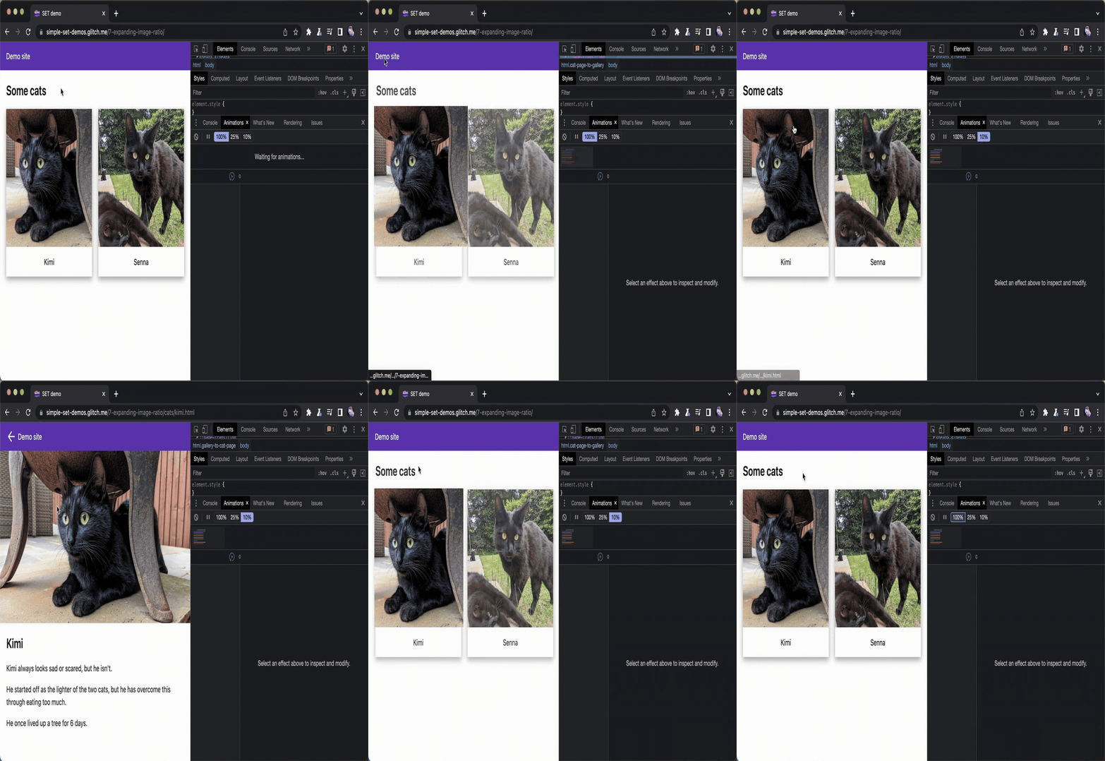
Source: Chrome for Developers, licensed under CC BY 4.0.
The official example explicitly styles the pseudo-elements with object-fit and clipping:
::view-transition-old(full-embed),
::view-transition-new(full-embed) {
  animation: none;
  mix-blend-mode: normal;
  height: 100%;
  overflow: clip;
}

::view-transition-old(full-embed) {
  object-fit: contain;
}

::view-transition-new(full-embed) {
  object-fit: cover;
}
So this is not something the View Transition API is incapable of solving. The browser exposes the tools; the author tells it which endpoint is cover, which is contain, and how the overflow should be clipped.
My implementation environment was different. SSGOI creates transitions with its own cloned elements and the Web Animations API instead of the View Transition API. The engine needed to solve the same geometry itself.
The bug appeared when a cover thumbnail transitioned into a contain detail image. Both endpoints preserved the source ratio, but scaling the clone from bbox to bbox made the image look as if it were following the container's ratio in the middle.

The first and last frames were fine. Only the transition between them was broken. If both bounding boxes were correct, the next thing to inspect was the actual image area inside those boxes.
One image has two rectangles
To reason about the bug, I separated the image geometry into a content rect and a visible window.
- Content rect: the full area occupied by the image after applying its intrinsic ratio and
object-fit. - Visible window: the portion of that content currently visible through the container.
With contain, the two are usually the same because the whole image is visible.
With cover, the content rect is larger than the card. The image extends beyond the container, and the container's bbox becomes a window onto only part of it.
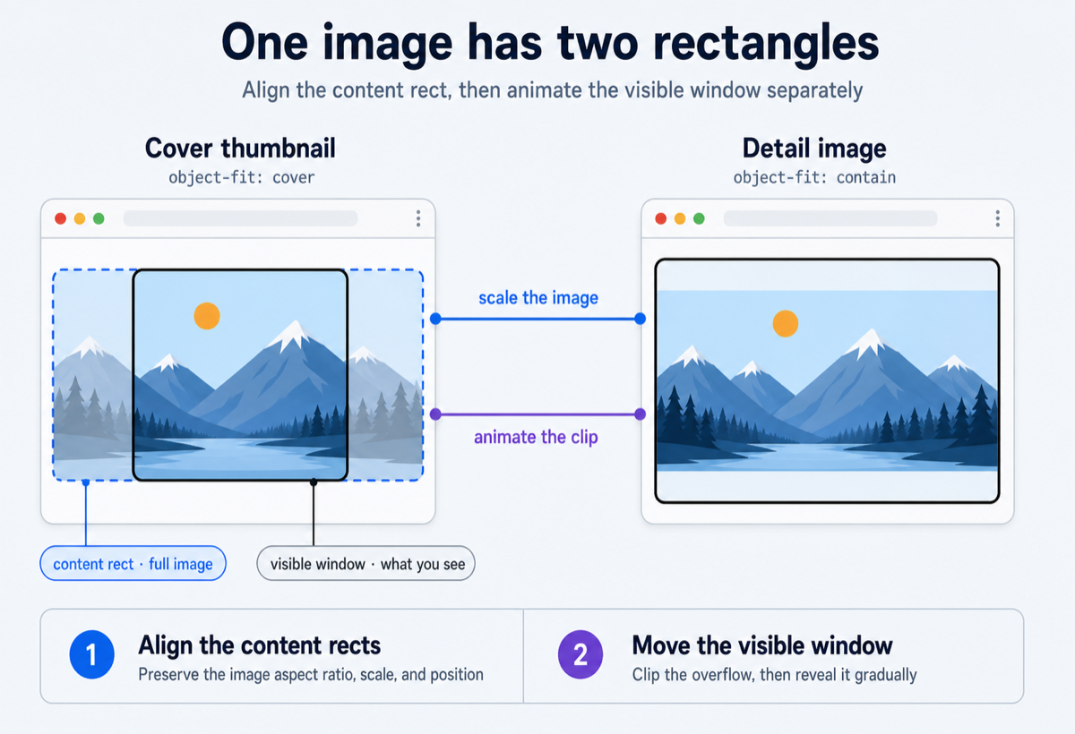
On the left, the black border is the visible thumbnail window. The dashed blue rectangle is the full content rect extending beyond the card. On the right, the full image is visible in the detail view.
Connecting only the two bboxes does not guarantee that the same point in the photo follows the same path. The content rects need to align first. The visible window must then change independently on top of them.
Inferring the geometry from the DOM
SSGOI's Hero and Zoom transitions connect an element in a list to its counterpart on a detail screen. The View Transition API lets an author style the old and new snapshots, but I did not want library users to repeat image information that already existed in their HTML and CSS.
The first version required callers to pass the image ratio and border radius manually. It worked, but the same information was now declared twice: once in the markup and styles, and again in the transition configuration.
Hero and Zoom now infer that information from the DOM when the structure is unambiguous:
- Check whether the keyed element is an
<img>. - If it is a wrapper, accept exactly one direct child
<img>. - Read the intrinsic ratio from
naturalWidth / naturalHeight. - If the image has not loaded yet, fall back to its
widthandheightattributes. - Read
object-fit: cover | containfrom computed styles. - Confirm that
object-positionis centered. - Read simple border radii and
overflow: hidden | clipfrom the wrapper.
Once those values are known, the content rect can be reconstructed from the bbox and the intrinsic ratio.
For contain, choose the dimension that keeps the whole image inside the box. If the box is wider than the image ratio, match the height; if it is narrower, match the width.
For cover, do the opposite. Choose the dimension that fills the box completely. If the box is wider, match the width; if it is narrower, match the height.
The result includes the image area cropped outside the thumbnail card. We can finally connect the photos themselves instead of connecting only their containers.
Scale the photo, not the box
For a Hero transition, the engine clones the destination image and initially places it over the source content rect. The starting scale is:
const scale = Math.max(
  fromContent.width / toContent.width,
  fromContent.height / toContent.height,
);
The transform uses one uniform scale instead of independent X and Y scales. If both content rects represent the same source image, their ratios should match and the two values should be almost identical. Taking the larger value ensures that tiny measurement errors do not leave a gap.
Position is based on the centers of the content rects, not the top-left corners of the bounding boxes:
const dx = centerX(fromContent) - centerX(toContent);
const dy = centerY(fromContent) - centerY(toContent);
Now a cropped cover thumbnail and a letterboxed contain detail image can live in different boxes while the actual photo keeps the same center and aspect ratio.
That fixes position and scale, but introduces one final problem. If the full image is visible immediately, the parts cropped out of the thumbnail suddenly appear in the first frame.
Moving the photo is not enough. The window through which we see it has to move too.
Scale moves the photo; clip-path moves the window
The visible window is animated with clip-path.
The engine maps the source crop window into the destination clone's content coordinate system. In other words: which part of the destination clone must remain visible for the first frame to look exactly like the source thumbnail?
That window can be expressed as an inset clip:
clip-path: inset(top right bottom left round radius);
The transition interpolates from the source clip insets to the destination clip insets. At the beginning, only the pixels visible in the thumbnail remain exposed. As the transition approaches the detail screen, the cropped regions are gradually revealed.
Rounded corners need the same treatment. If a clone with border-radius: 16px is scaled by 2, the radius appears as 32px on screen. The visible radius is therefore interpolated first, then divided by the current scale before being written to the clip path:
const clipRadius = visibleRadius / currentScale;
The division of responsibility became simple:
Scale and translate move the photo.
clip-pathmoves the window through which the photo is seen.

Infer only what can be known safely
Once automatic inference starts working, it is tempting to support everything: search every descendant image, inspect <picture> and <video>, and handle every possible object-position and radius.
But a wrong guess on one endpoint produced a result worse than the original bbox transition. I kept the inference deliberately conservative. It falls back when it encounters:
<picture>or<video>- multiple direct child images
- deeply nested structures where the shared image is ambiguous
- a custom, non-centered
object-position - different intrinsic aspect ratios at the two endpoints
- radii that cannot be reduced to simple pixel values
- image metadata detected at only one endpoint
In those cases, both endpoints return to the original bbox animation. The engine never applies content-aware geometry to only one side.
A simpler transition can pass unnoticed. A face becoming wide and snapping back cannot. It was better for the library to intervene only when it could explain the structure with confidence.
The native API and the custom engine reached the same answer
After implementing this, I found that the View Transition API had already accounted for the same class of problem. It lets authors give differently shaped old and new snapshots their own object-fit values, then clip the overflow as the crop changes. The direction matched the solution I had reached in SSGOI.
The difference is who supplies the rule. With the View Transition API, the author styles the fit and clipping for each transition. SSGOI reads the <img>, intrinsic ratio, computed object-fit, clipping wrapper, and radius from the existing DOM, then makes that decision automatically when it can do so safely.
My first implementation was not mathematically wrong. Both bounding boxes were accurate. The mistake was assuming that the box was what the user was watching. It was not. The user was watching the photo inside it.
The fix was to align position and scale using the full content rect, then interpolate the visible window separately with clip-path. When the DOM did not provide enough evidence, both sides fell back to the simpler bbox transition.
This was a hard problem to encounter while thinking only in React components. It became visible only after going down a layer: how large did the browser actually draw the image, where did it place those pixels inside the box, and which part did it expose?
A shared element transition begins by connecting two rectangles. Once a photo enters those rectangles, it also has to connect the same pixels—and decide how much of them the user should see along the way.
Try the implementation
This content-aware geometry now powers the Hero and Zoom transitions in SSGOI. For common <img> structures, the library reads the DOM and CSS instead of requiring the image ratio and radius again in transition options.
SSGOI is an open-source page transition library for React, Next.js, Svelte, Vue, and other web frameworks. Alongside Hero and Zoom, it includes transitions such as drill, scroll, and sheet.
You can see the transitions on ssgoi.dev and browse the implementation on GitHub.