
zoom
The whole detail page unfolds from the selected card or image, using that element as its spatial anchor.
Drill-in — List → detail, going one level deeper.
When this motion fits
- When to use
- Use it when a selected card or image should visibly open into its dedicated detail page.
- What moves
- One matched source expands toward the destination while the rest of the page follows the chosen type.
- Avoid when
- Avoid it when several shared elements should move together, or when the detail page cannot provide exactly one destination marker.
Add it to a route rule
zoom() sets the motion; the rule around it decides which navigations get it. The config shape is the same in every framework.
import { zoom } from "@ssgoi/react/view-transitions";

const config = {
  transitions: [
    {
      from: "/list",
      to: "/detail/*",
      transition: zoom(),
    },
  ],
};
Pattern forms, priority and the scroll defaults that come with each rule shape are on Route rules.
Connect the source to the destination
The value identifies the selected entity. The destination key must exactly match the source card or image that opened it.
| Page | Attribute on the element |
|---|---|
| Source page | data-zoom-exit-key="same-id" |
| Destination page | data-zoom-enter-key="same-id" |
- A list may contain many exit markers as long as each key is unique.
- The detail page must contain exactly one enter marker.
- If the same exit key is duplicated, the first element in DOM order is used.
{/* Source: many unique cards are allowed */}
<img
  data-zoom-exit-key={photo.id}
  src={photo.thumbnail}
  alt={photo.alt}
/>

{/* Destination: exactly one enter marker */}
<img
  data-zoom-enter-key={photo.id}
  src={photo.full}
  alt={photo.alt}
/>
Configurations
type, variant and option are independent. Each clip is recorded from a demo published on ssgoi.dev. Combinations without a published demo keep the API details without a substitute clip.
static · default
type: staticvariant: defaultdefaultThe originating surface stays visually steady while the selected content opens above it. Controls drawn over the shared image, and any list chrome the card sits under (a tab bar, a badge), crossfade with the tile instead of popping when it lands.
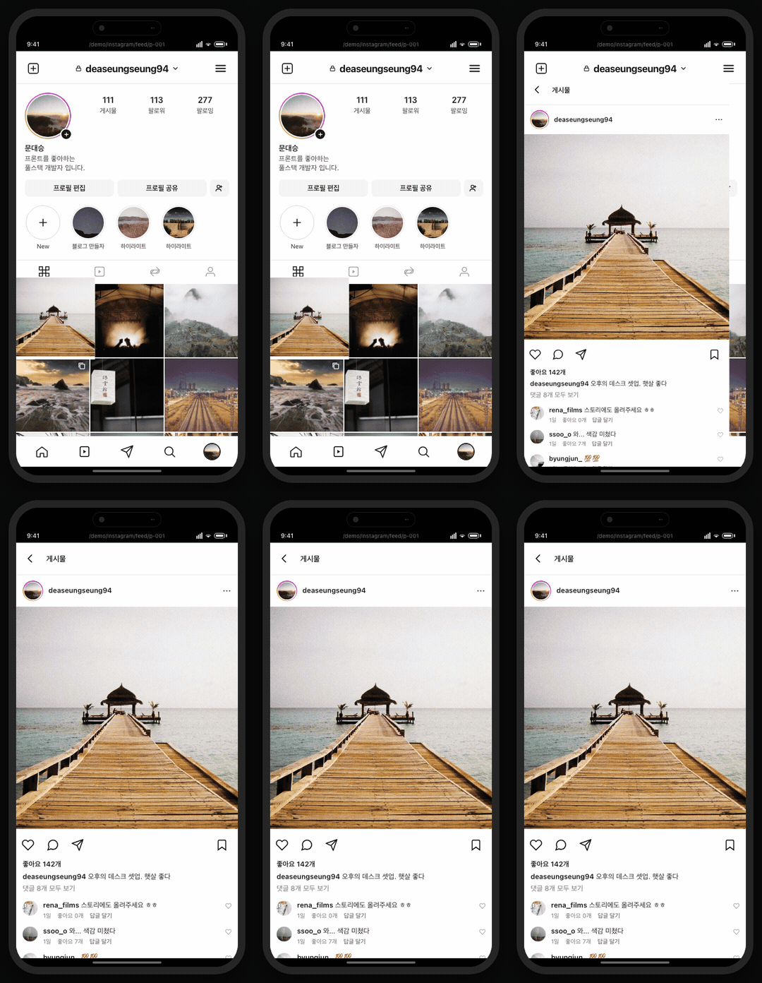
zoom({ type: "static" })Open live demoOpens at the source screen
static · fade
type: staticvariant: fadeFades the whole detail page around the shared image, not only what overlaps it, while retaining the same anchored zoom.
zoom({ type: "static", variant: "fade" })expand · default
type: expandvariant: defaultThe selected card grows into the detail surface, making containment feel explicit.
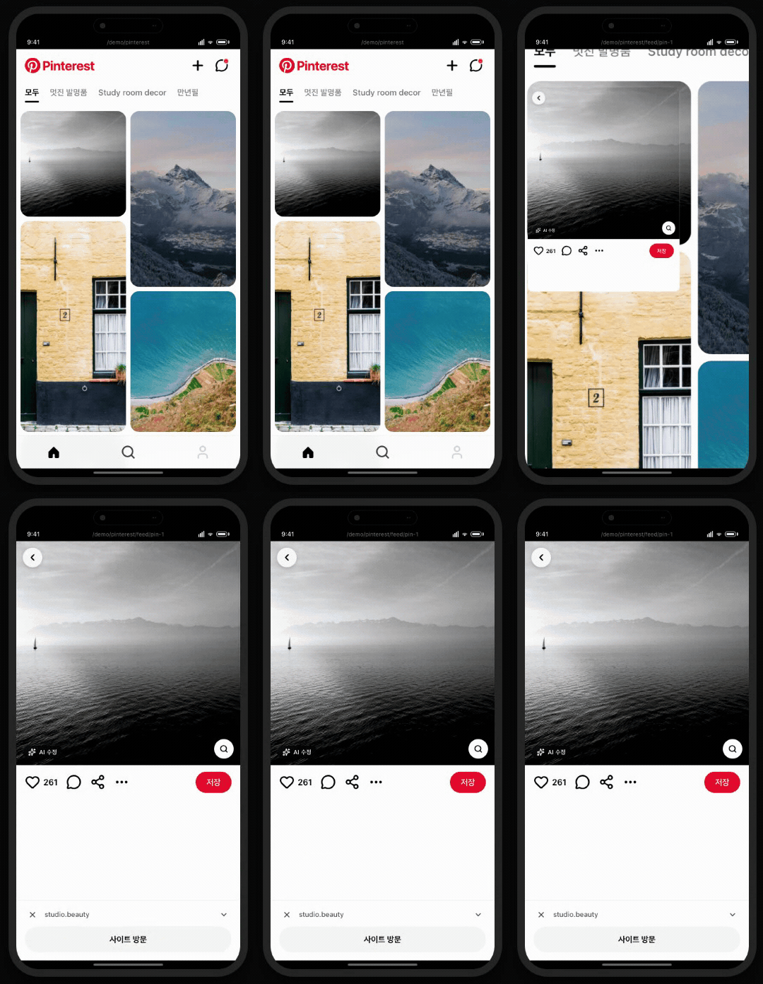
zoom({ type: "expand" })Open live demoOpens at the source screen
expand · fade
type: expandvariant: fadeKeeps the card-to-surface expansion but fades surrounding content for a softer reveal.
zoom({ type: "expand", variant: "fade" })Open live demoOpens at the source screen
blur · default
type: blurvariant: defaultThe background loses focus as the selected content advances, creating a strong focus pull.
zoom({ type: "blur" })blur · fade
type: blurvariant: fadeCombines the focus-pull blur type with the optional fade modifier.
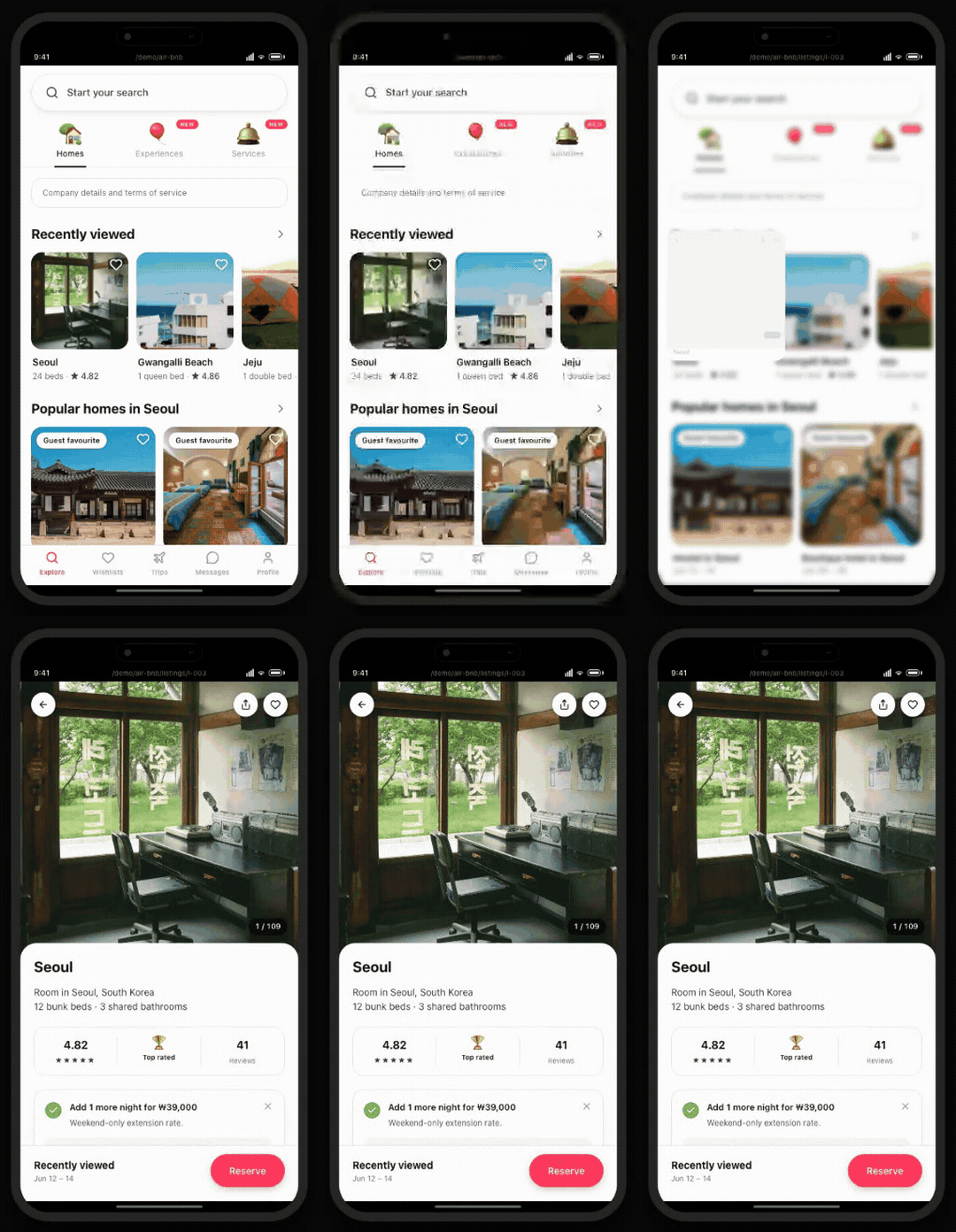
zoom({ type: "blur", variant: "fade" })Open live demoOpens at the source screen
Agent guide: /llms/transitions/zoom.txt — every prop, the required markup, and a config fragment as plain text.